
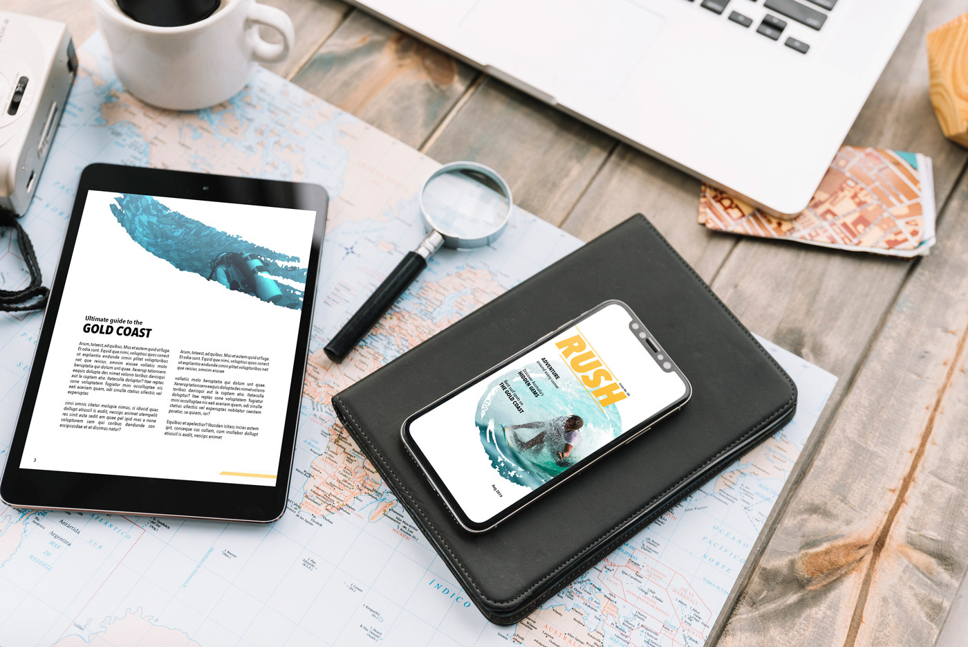
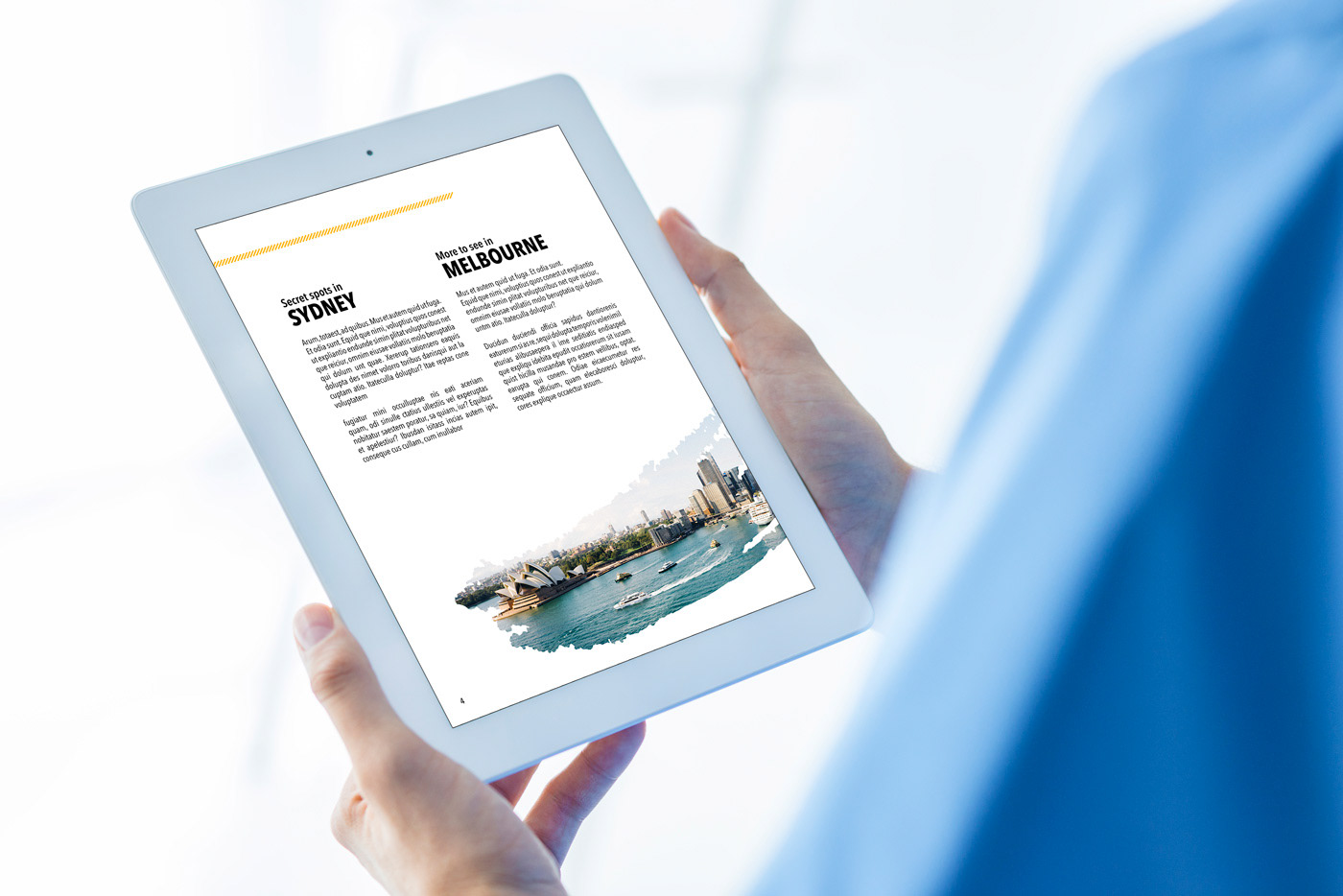
Travel magazines that catch my eye are bold and portray a sense of thrill. I wanted to keep the overall layout very open and airy, to contrast the traditional magazine layout that generally feels cramped and overwhelming. The goal with this magazine layout was to still portray that sense of thrill, while taking a more modern and open layout approach. The most challenging part of this project was adapting a print layout across multiple digital platforms.
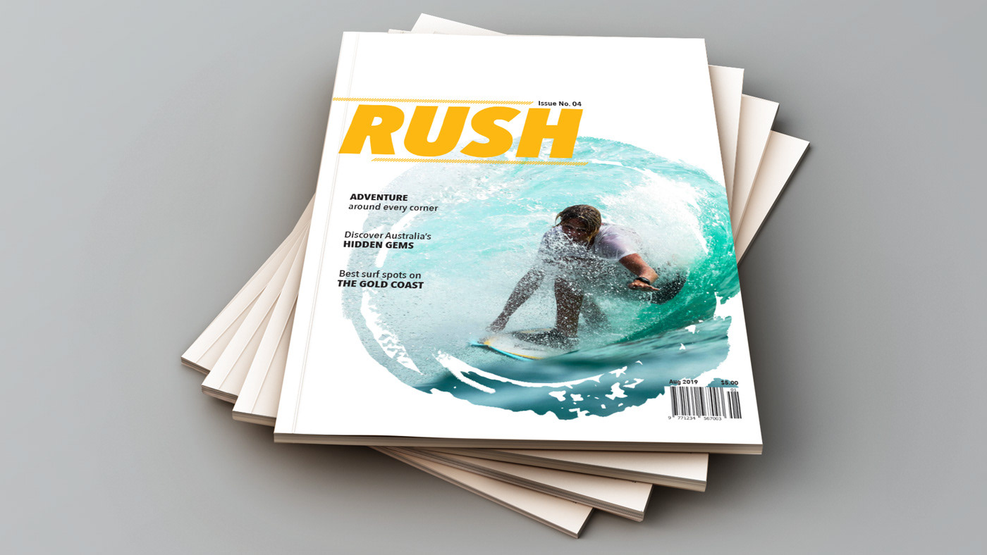
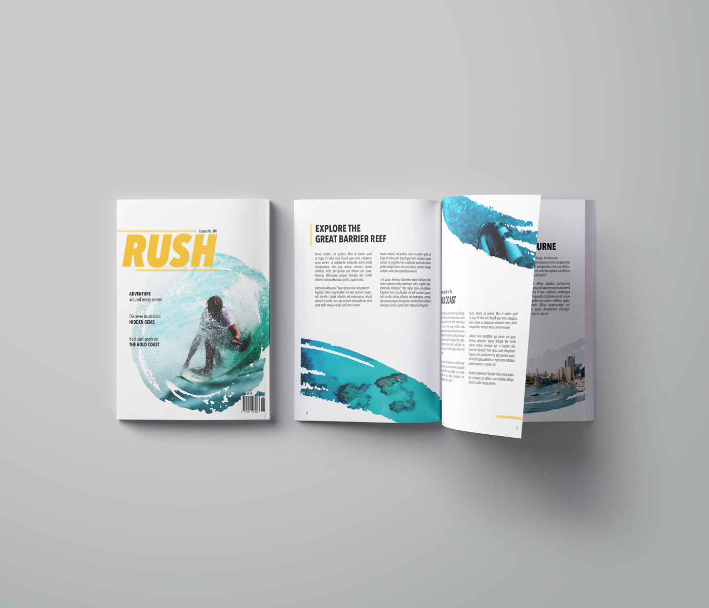
I used the white space to bring focus to the shocks of blue and hints of yellow throughout the magazine through the photos and text. The yellow is used to grab attention as well as evoke that RUSH of excitement for their next adventure, focusing on the different aquatic activities and beauty of Australia. I masked the photos with a texture to add intrigue and add a sense of dynamic movement.
Time: 2 weeks
Programs: Adobe Indesign, Adobe Photoshop