
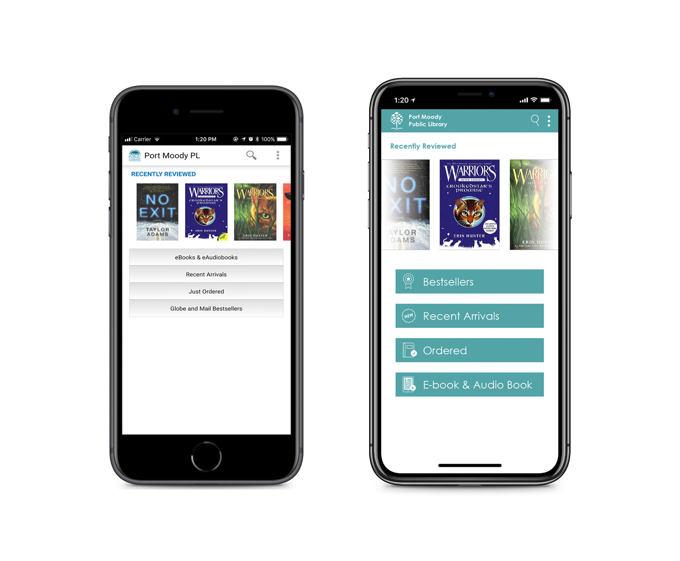
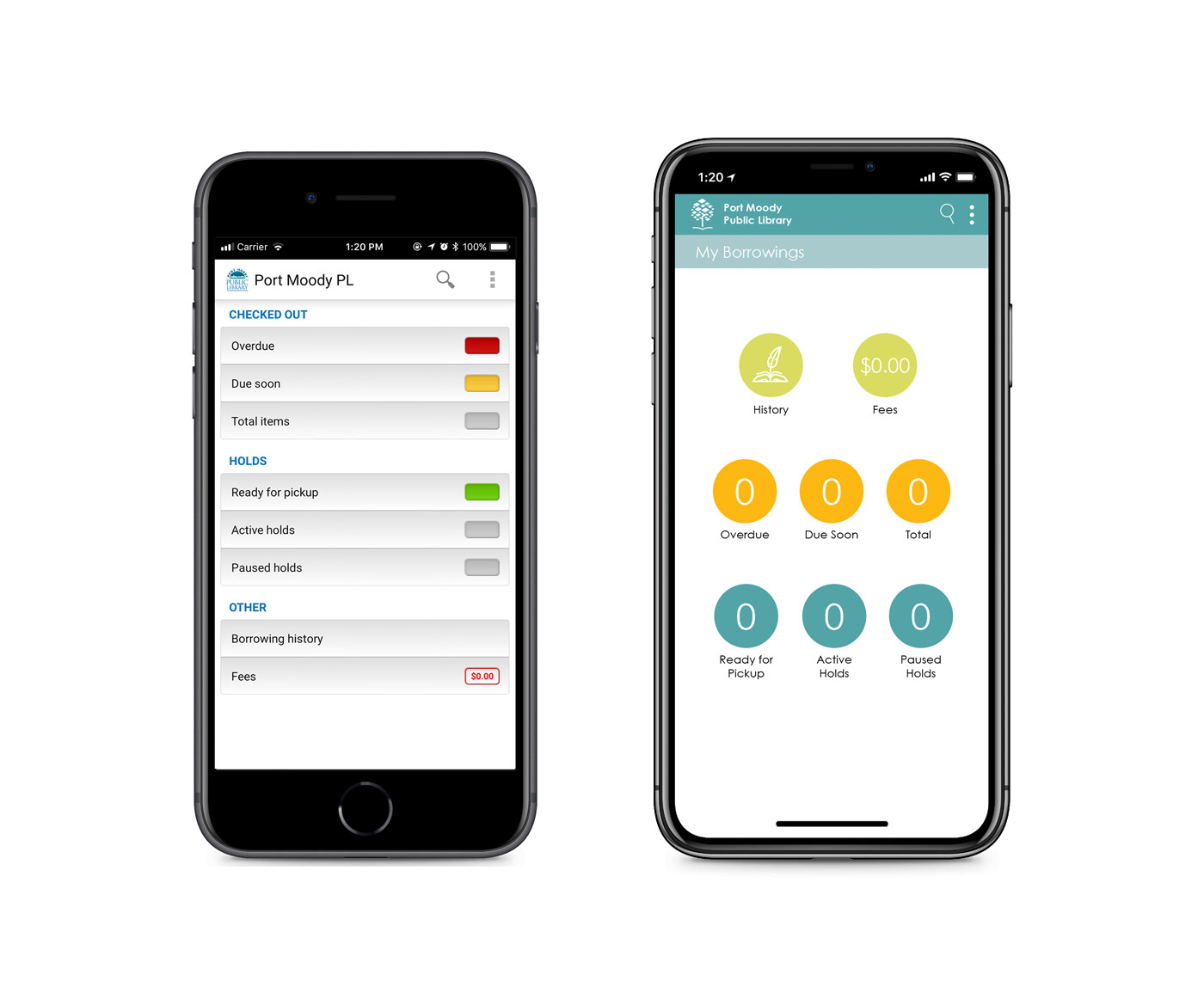
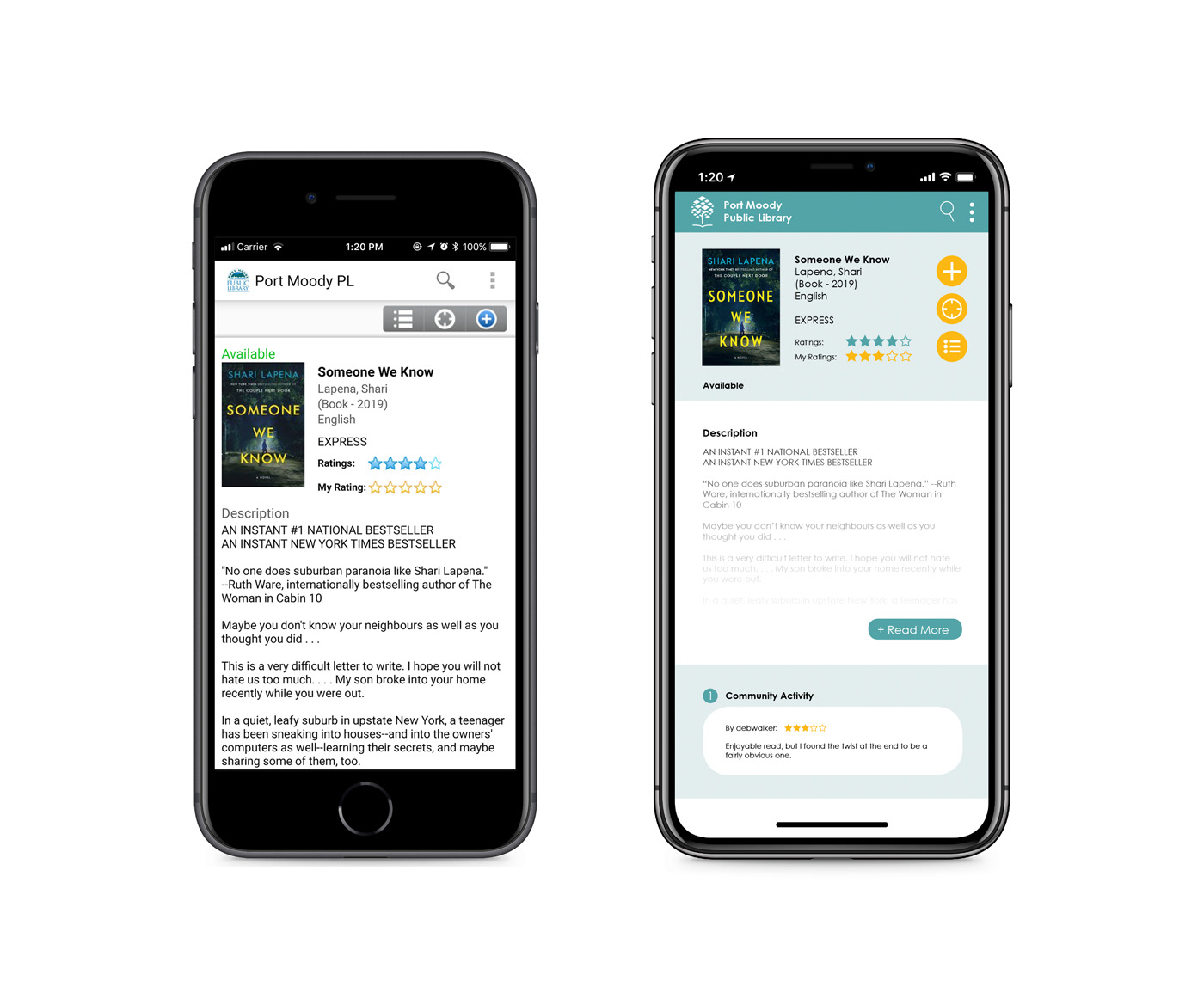
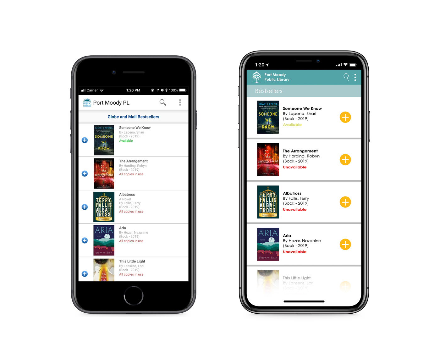
The layout of the Port Moody Public Library app is devoid of colour and doesn't look to have had an upgrade in awhile. The goal of this redesign was to refresh the look and bring some life to the app through colour and smoother flow. The layout was inspired by their current website, which seems to have been updated more recently with a new look and logo, unlike the app. Utilizing their new logo, I pulled those colours to use throughout the redesign to keep everything cohesive and familiar.
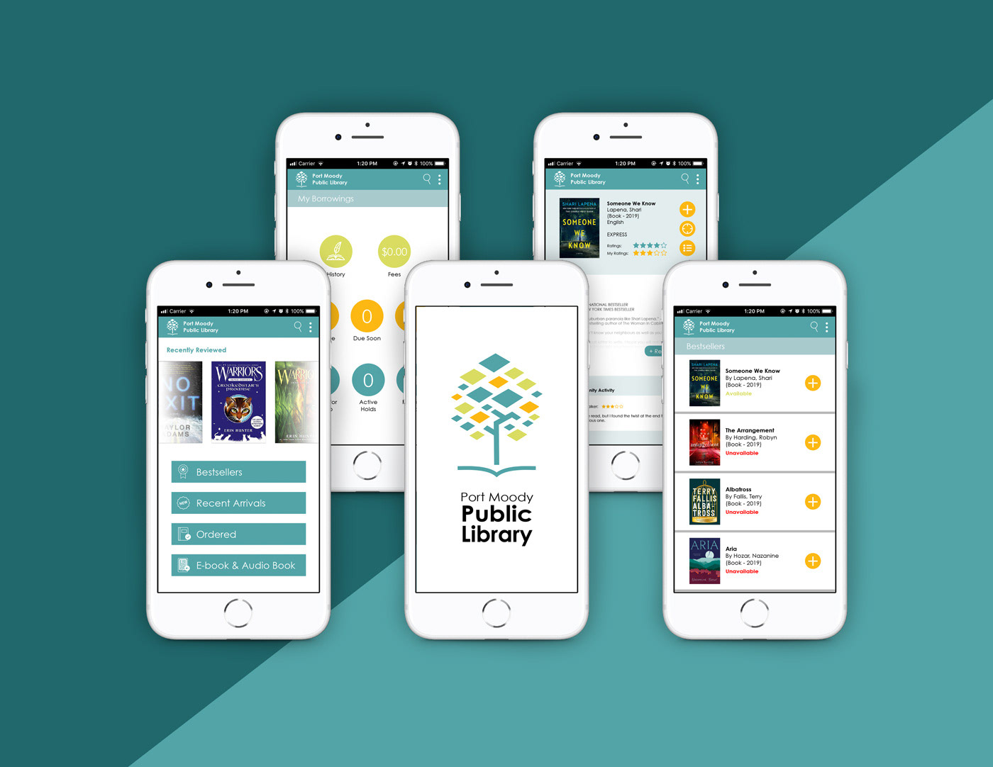
I tried to utilize a more negative space where I could, spacing out the buttons and arranging elements so that they didn't feel as cramped.
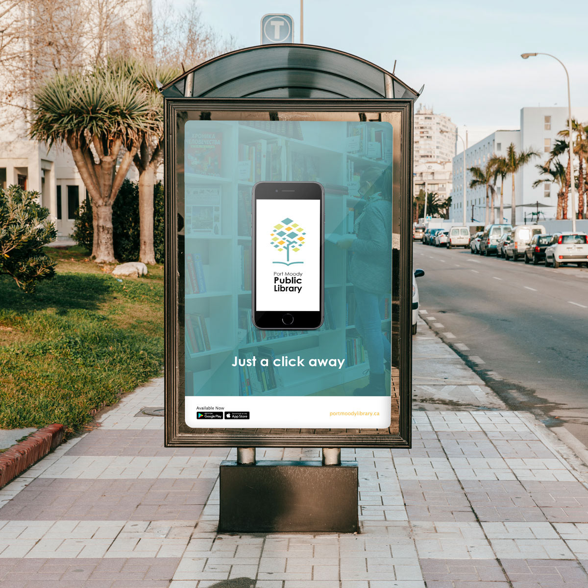
If there was ever a relaunch for the app, I'd keep advertising simple, clean and modern to reflect the new look. Since the target demographic would be students and young adults primarily, having advertisements at transit stops would be right in the line of sight of the target audience.
Time: 3 weeks
Programs: Adobe Illustrator, Adobe Indesign